

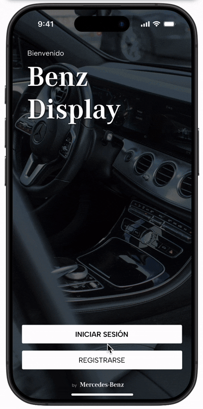
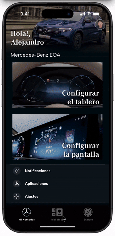
Benz Display allows Mercedes-Benz users to customize their car's dashboard and display, tailoring the information and visuals to match their preferences and needs. The app saves configurations in a design library, enabling users to create and enjoy unique experiences for every journey. With an intuitive interface, it ensures a personalized experience for each user, regardless of age or gender.

ROLE
UX Design, User Research, Information Design
TOOLS
Figma, Wireframing, Adobe Suite, User Interview, Research, Prototyping
DURATION
2 months
PROBLEM
Users are as diverse as their needs, desires, and aspirations during each journey. Not everyone seeks or values the same vehicle information while driving, and no trip is the same. Driving to the office daily differs from taking a road trip or traveling with friends or family.
SOLUTION & OBJECTIVES
Design a user experience that allows customization of the vehicle's dashboard and display, incorporating a library of designs. This ensures very user can create a unique, personalized experience tailored to their needs for each journey.
User Research
I conducted interviews and created empathy maps to better understand Mercedes-Benz users, their needs, and habits. The research revealed recurring behaviors among drivers during different types of trips, analyzing their motivations and activities while driving.
It was discovered that the time spent in the car significantly impacts their mood. During daily commutes (e.g., driving to the office), users prioritize efficiency to manage obligations like checking their calendar, making calls, or listening to podcasts. In contrast, non-routine trips emphasize relaxation and comfort, enjoying quality time with family or friends. This highlights the importance of tailoring the vehicle experience to the specific context of each journey.
PAIN POINTS
Unable to select the specific information they want to view.
Overload of unnecessary information.
Information
Lack of options to customize the vehicle's interior appearance.
Personalization
Some functions or information are hard to read or access while driving.
Emphasis
Personal settings are disrupted when someone else uses the car.
Control
PERSONA development
Paulina Sandoval is a professional who seeks to make the most of her daily commutes to work. She needs these trips to be productive, enabling her to make calls, listen to the news, and manage her car's services, especially given the long hours spent in traffic due to the city's heavy congestion.
Creating a user journey map for Paulina Sandoval helped identify her needs, frustrations, and desires during her daily commutes. This analysis revealed how her first trip of the day directly impacts her mood, emphasizing the importance of an efficient and comfortable driving experience.

Design and Concept
The process began with developing a clear and appropriate information architecture for the project’s three key screens. Focusing initially on the app, I defined the navigation, text layout, and image placement that would serve as hyperlinks. At the same time, I designed a dashboard that could integrate widgets and essential information for safe and efficient driving. I also worked on a multifunctional screen for the car, capable of being configured intuitively. All of this was conceptualized to ensure functionality and an optimal user experience.

Iterations for the Benz Display app
Iterations for the Board
Iterations for the Screen
Lo-fi PROTOTYPE
Low-fidelity prototypes were created to structure the spaces and establish a clear hierarchy in the app's sections. The main action, "configure the dashboard and screen," was positioned as the central focus of the design, while complementary services were organized in a secondary but accessible manner.
The navigation was designed based on this hierarchy, with static elements in the upper and lower areas (such as the screen title and main menu), ensuring consistency and ease of access. The dynamic content was strategically placed in the center, where users interact directly with the main options, optimizing the user experience and ensuring an intuitive flow for initial user testing.


Implement a fixed menu that allows easy access to the main sections: the home screen, the configuration library, and the tips section.
Fixed Navigation Menu
Prioritize the most used functions in the central areas and the fixed menu to reduce the time required to complete common tasks.
Quick Access to Key Functions
Design the central section to highlight the configuration of the dashboard and screen, ensuring intuitive access and prioritizing user interaction.
Focus on Configuration
Incorporate visual indicators that highlight the active section, helping users understand where they are within the app.
Visual Feedback
Maintain a hierarchical structure that differentiates the upper section (title or header), the main content (center), and the fixed menu (bottom), ensuring smooth and organized navigation.
Clear Visual Hierarchy
Flowchart
After designing the page layouts, I developed a flowchart to map the key interactions and connections between the app’s sections, ensuring intuitive and consistent navigation. With this foundation, I created a low-fidelity prototype specifically designed for usability testing, allowing me to validate the initial flows and functionalities with real users.


Usability Study
I conducted two rounds of usability studies to evaluate the app’s effectiveness and accessibility at different stages of development. In the first round, low-fidelity prototypes were analyzed, which helped guide the design from initial sketches to more detailed mockups. Later, in the second round, I used a high-fidelity prototype to identify specific improvements that would optimize the user experience.
Round 1 Findings
Need for Multiple Profiles
Users requested the option to manage multiple profiles to personalize their experiences.
Round 2 Findings
Synchronization from the Library
Users suggested that synchronization should occur directly from the library, without needing to return to the screen and dashboard settings.
Navigation Difficulties
Some users had trouble locating the "Benz Display News" section.
Confusion When Going Back
Navigating back to previous screens was unclear for several users.
Dynamic Transitions
It was proposed that transitions between screens be smoother and visually more appealing, rather than simple scrolling.
Style Guide
I established a cohesive visual design guide aligned with Mercedes-Benz’s branding. Corporate typography (Mercedes-Benz Corporate A and S) was chosen to reflect elegance and modernity. The color palette combines black, white, and silver as the primary tones, with blue accents. The iconography is minimalist and functional, and components such as buttons feature rounded edges and symmetrical alignment, reflecting precision.

hi-fi Prototype
After gathering and analyzing feedback from the usability studies, key iterations were made to the prototype screens. User observations were incorporated to improve the clarity and accessibility of actions, making navigation and interactions more direct and fluid.
With these adaptations, a high-fidelity prototype was designed that reflects a more intuitive experience, focused on the needs and expectations of the user.
For example, the ability to sync directly from the library was added to simplify the process, eliminating unnecessary steps. Screen transitions were also improved, making them more dynamic and visually appealing, based on user suggestions. Additionally, key elements like the "Benz Display News" section were adjusted to make its location more intuitive, and solutions were implemented to ease navigation back to previous screens. The addition of multiple profiles in the app was also considered to better meet the needs of different users.
The final high-fidelity prototype integrates more intuitive user flows, allowing users to efficiently design, edit, save, and sync the screen and dashboard of their vehicle. These improvements ensure a smoother, more personalized experience, aligned with the needs and expectations identified during the design and testing process.

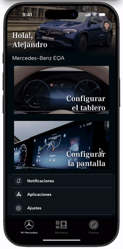
Control your vehicle easily and intuitively
From the first use, the app automatically configures to recognize your car's specific features. This turns your phone into a complete control center, designed to transform every journey into a personalized experience.
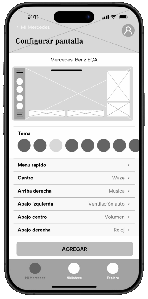
Preview and real-time configuration
The intuitive interface allows you to instantly visualize changes made to the widgets. This ensures that the settings reflect the user’s preferences exactly, simplifying the customization process.
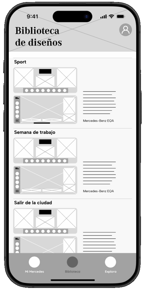
Create and manage a personal design library
Customized designs are stored in an accessible library, ready to sync directly with the vehicle. Additionally, you can edit your configurations at any time to adapt them to new contexts or needs.
Adaptable profiles to share the experience
Benz Display allows two or more profiles to be connected to the vehicle, giving each user the ability to personalize their settings and enjoy a unique and exclusive driving experience.

Complete management from a control center
Activate, deactivate, and adjust apps and notifications from a single screen. This functionality gives the user full control over the information they want to see and use while driving.
Get inspired and optimize each journey
Explore tips, news, and resources designed to enhance your trips. Benz Display invites you to create unique experiences for each type of journey, maximizing the value of your time in the car.

Accessibility Considerations
Smart transitions for clear orientation
Smooth and visually intuitive transitions were implemented when editing different sections of the screen and dashboard. This helps users better understand the location and arrangement of widgets or key elements, improving their orientation within the interface.
Clear iconography and alternative text
Universal icons, alternative text for images, and descriptive titles were used to facilitate navigation for users with special needs, including those who use screen readers or have visual impairments.
Real-time preview for accessible design
The interface allows an exact preview of changes made in real-time, providing immediate feedback and helping users make informed and precise decisions during the customization process.

Impact
Benz Display transforms the interaction between users and their vehicle, offering total control over their driving experience. The customization of the screen and dashboard not only fulfills unique desires and aspirations but also positively influences the mood of users during each journey.
"This is really easy, I can create multiple designs and leave them depending on how I want my day to go."
"I only keep the essentials here; the rest is handled by the mechanic or my boyfriend." — User quotes.
What I learned
The constant iteration process was key to the project's development. Each iteration allowed me to refine ideas, align the design with user expectations, and clarify the overall vision of the project. This approach not only helped improve the product but also deepened my understanding of how a well-designed user experience can directly influence users' mood and their perception of time inside the vehicle. The importance of listening to feedback and adapting it became clear as a cornerstone of UX design.
Next Steps
Conduct a final usability study
Evaluate the developed version of the app in a real environment, inside a vehicle, to experience how the design of the screen and dashboard impacts the driving experience. This study will help identify areas for improvement and ensure that the final product meets user expectations.
Deepening user research
Expand knowledge of the specific needs of users related solely to their interaction with the screen in the car. This will include identifying usage patterns, functional preferences, and elements that further enhance the driver’s experience and safety.